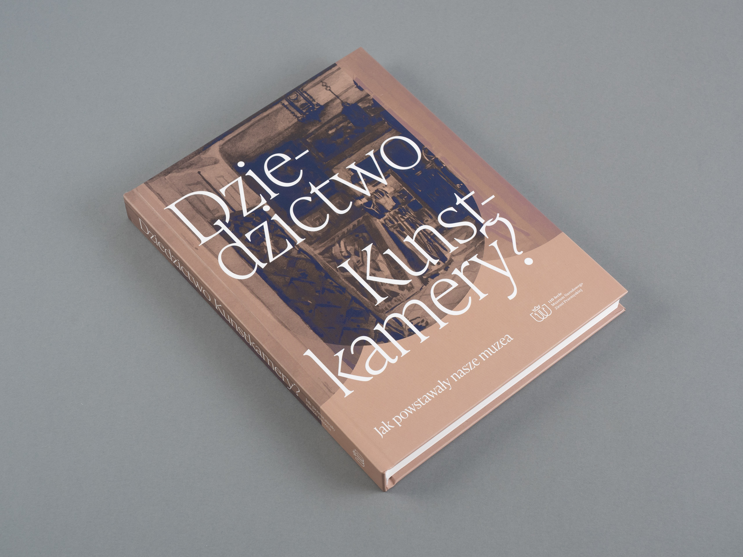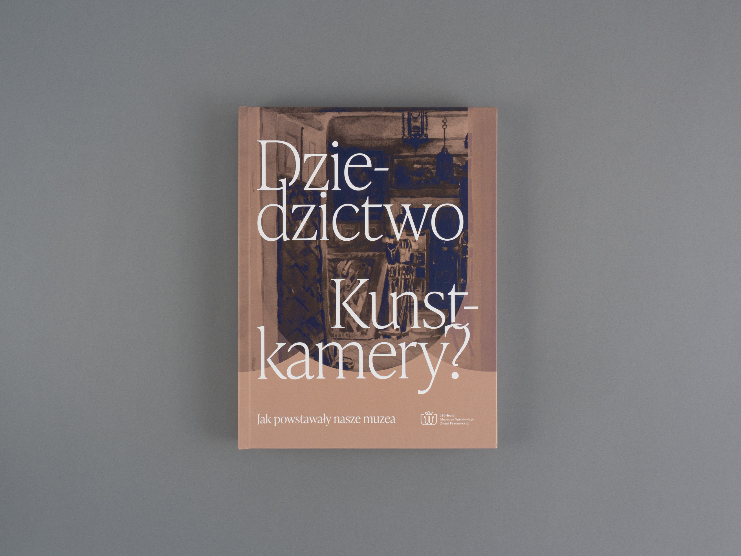
The rebranding of The National Museum of the Przemyśl Land is a project initiated in connection with the celebration of the 110th anniversary of the museum. It was officially launched with the exhibition on April 10, 1910, organized at that time by the Museum of the Society of Friends of Learning in Przemyśl, which was renamed a little later in the 1920s.
The challenge was related to the connection of many contrasts and inconsistencies of the collections. On the one hand, over a hundred years of history of the museum that requires respect, and on the other, high modernity, supported by the characteristic new-fashioned shape of the building nominated for the prestigious Mies van der Rohe award. The diversity of the collections and the topics covered did not facilitate the project, which results from the museum's activity profile based on the heritage of art.
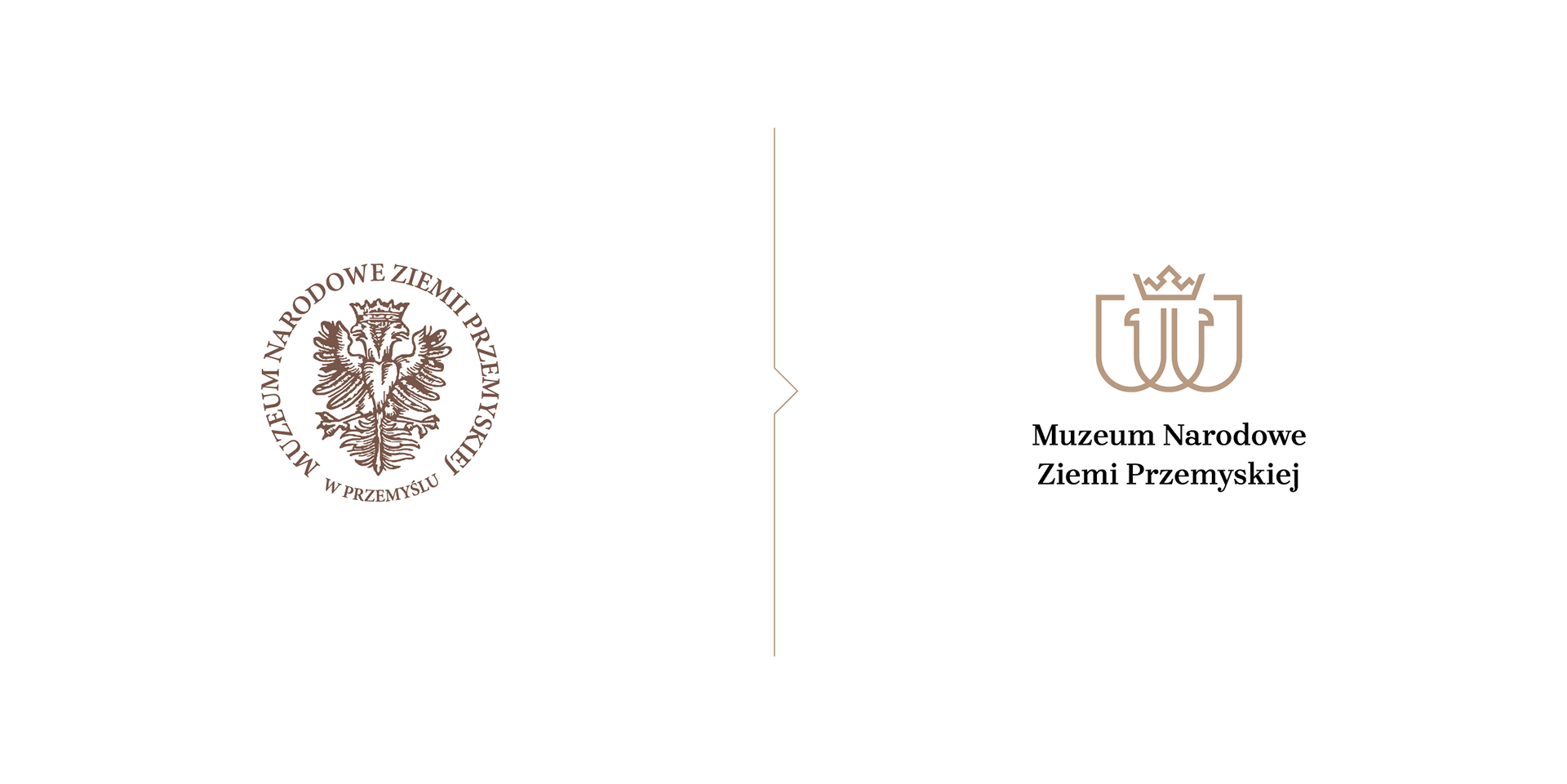
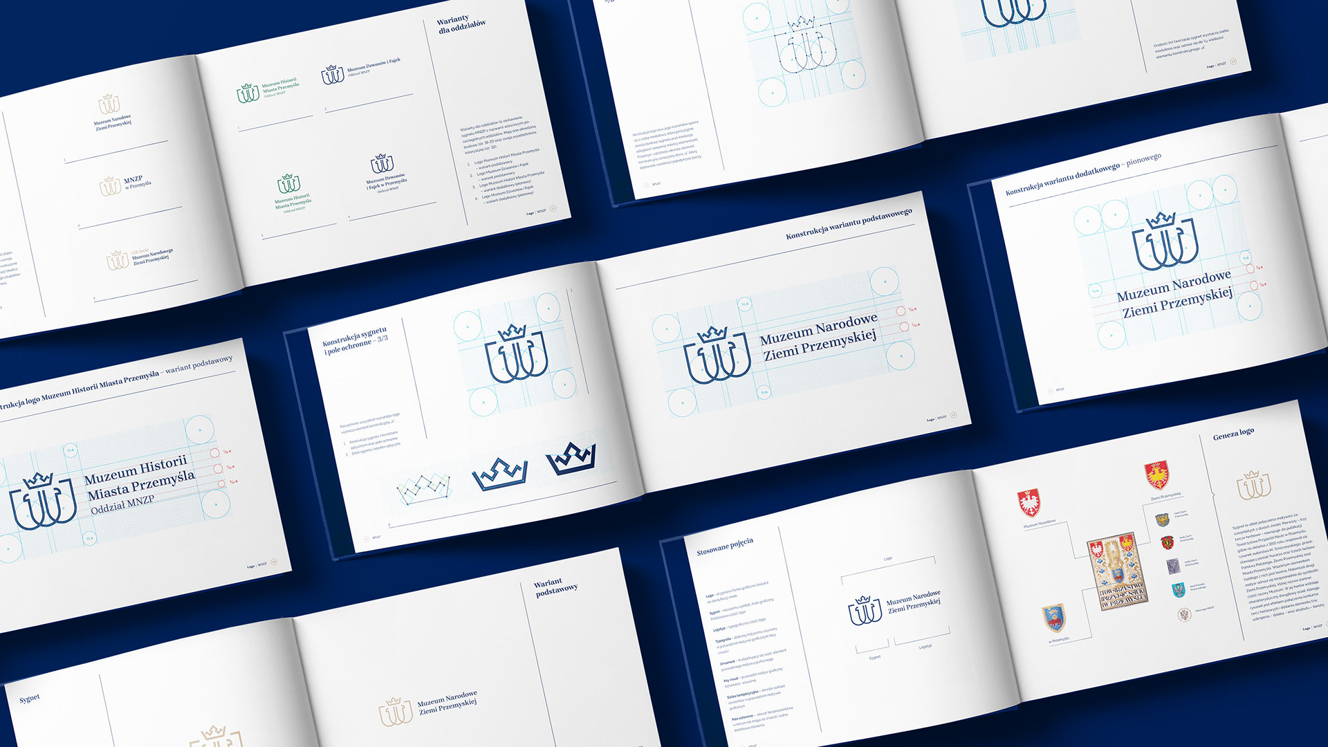
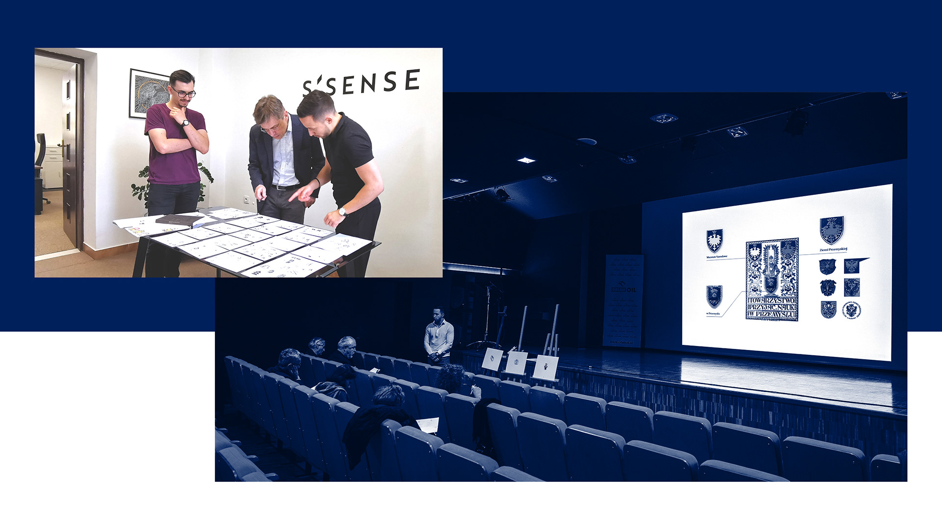
The logo symbol is the result of a combination of themes taken from two sources.
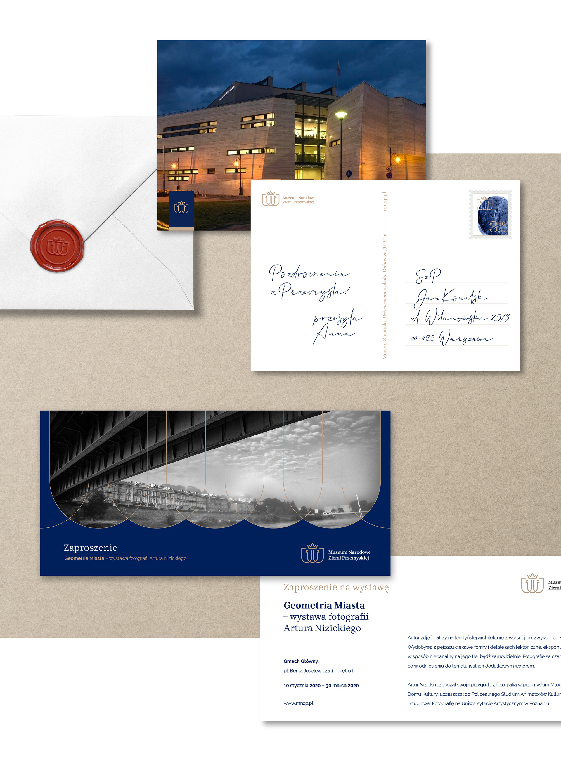
The first - three coats of arms – refers to the publication of the Museum of the Society of Friends of Learning in Przemyśl, where the cover from 1910 featured a drawing by Karol Tchórzewski, showing the figure of a hussar and three coats of arms: the Polish State, the Przemyśl Land and the City of Przemyśl. The crown is the connecting element of each of them.

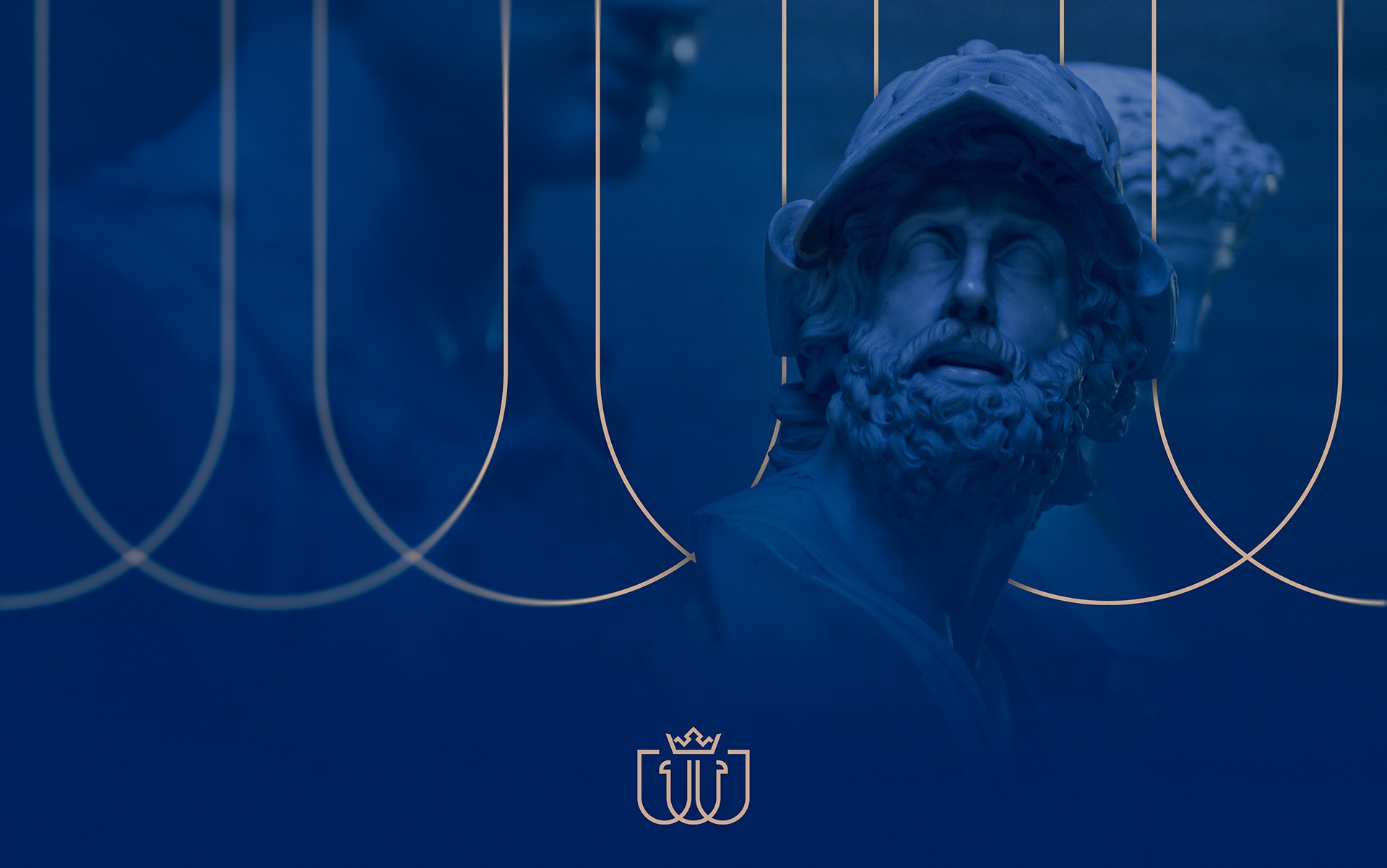
The second theme refers directly to the symbolism of the Przemyśl Land, whose name is part of the Museum's name. Its coat of arms features a characteristic double-headed eagle, the drawing of which is the result of combining the contours of the coat of arms and adding the element of the armament - beak, and attribute - crown.
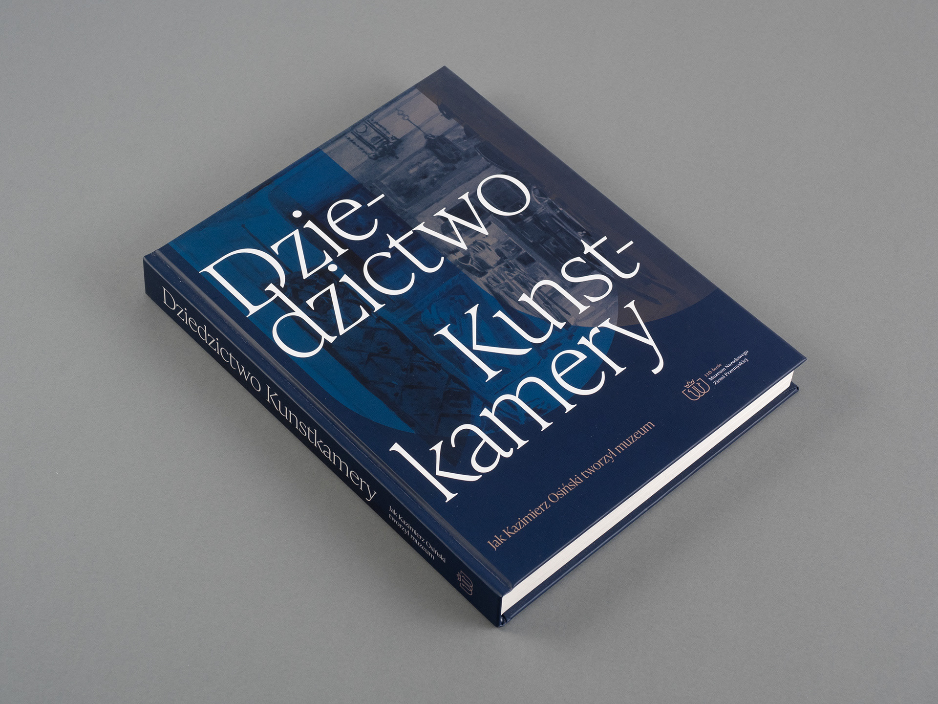
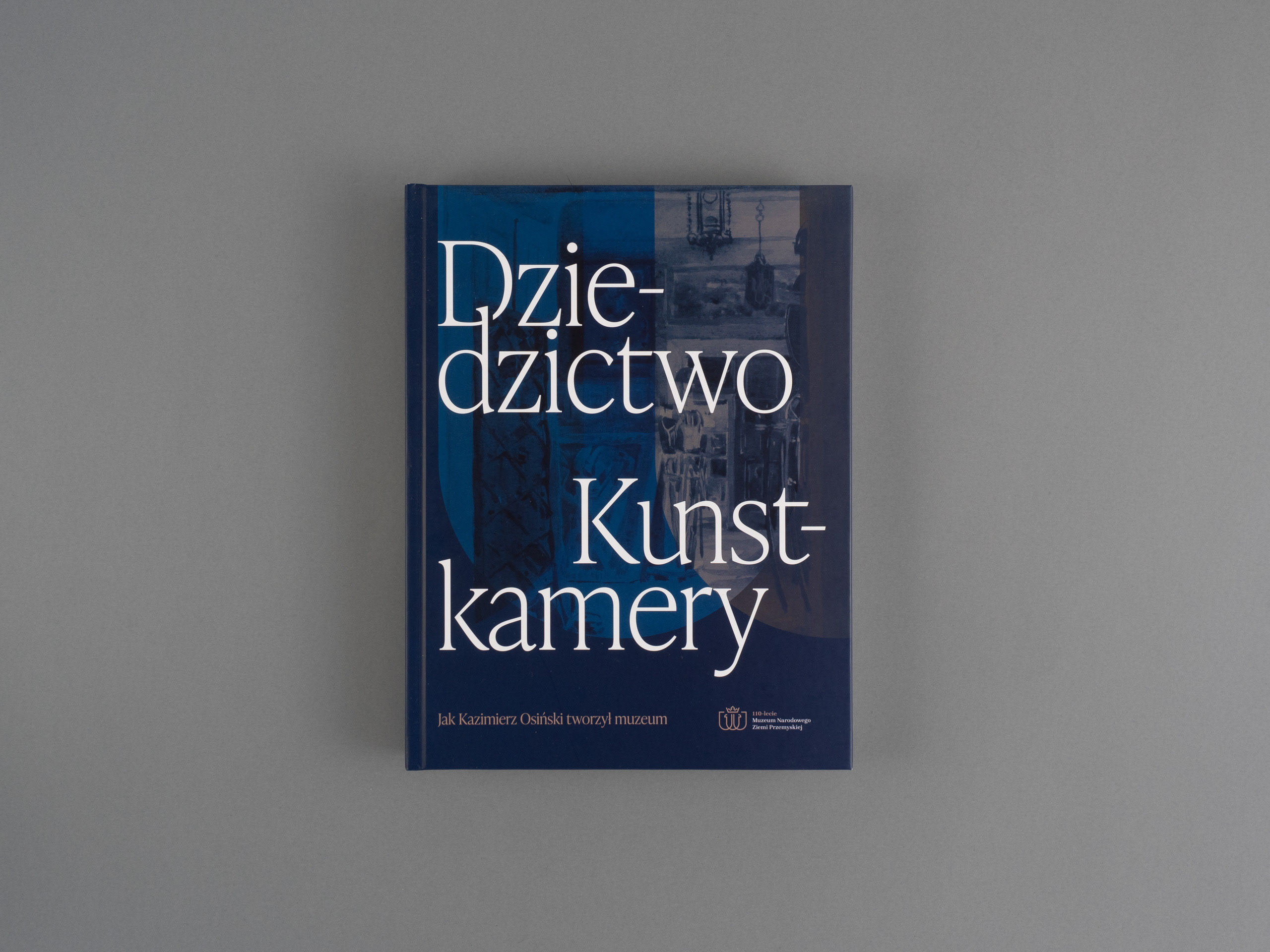
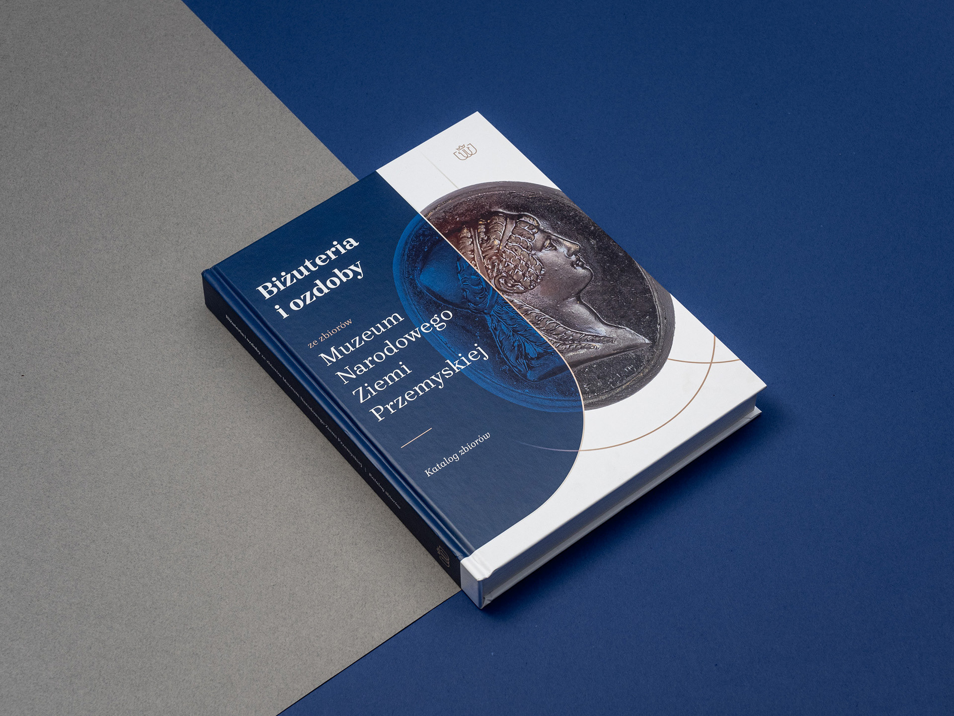
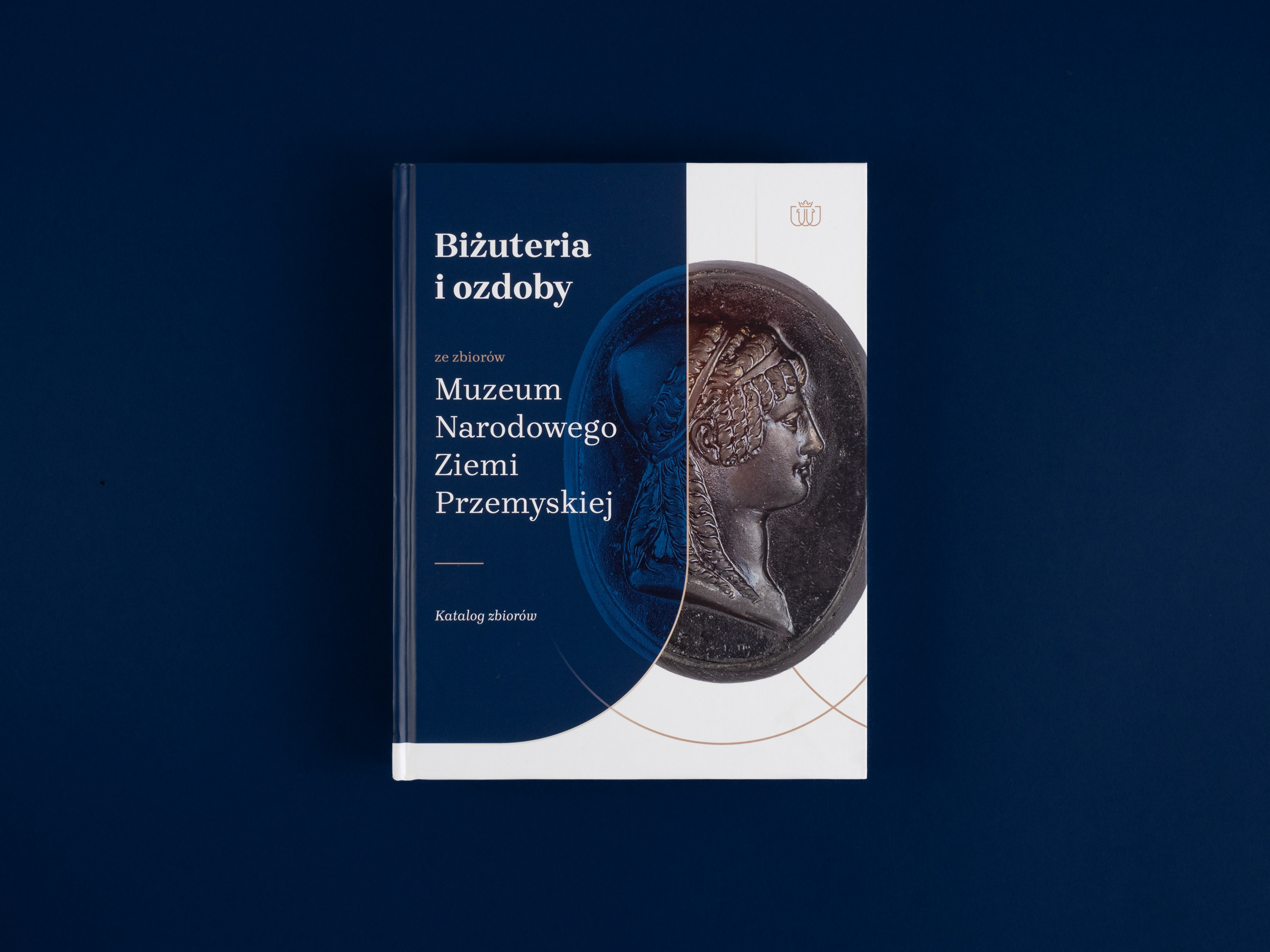
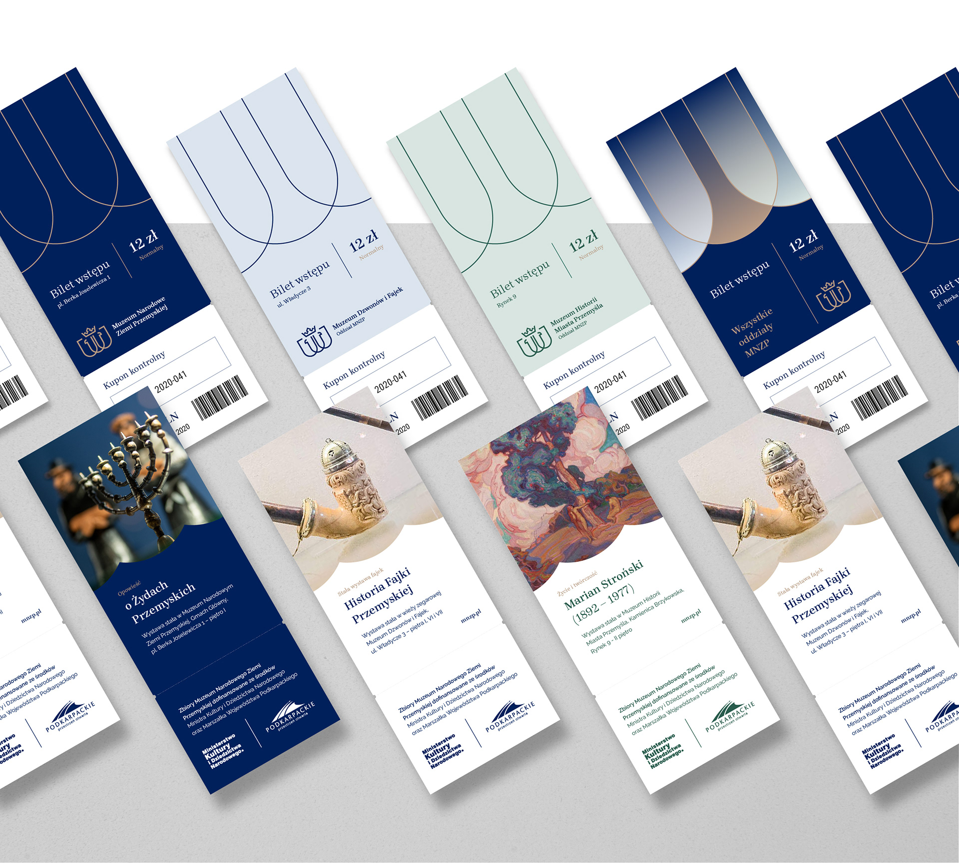
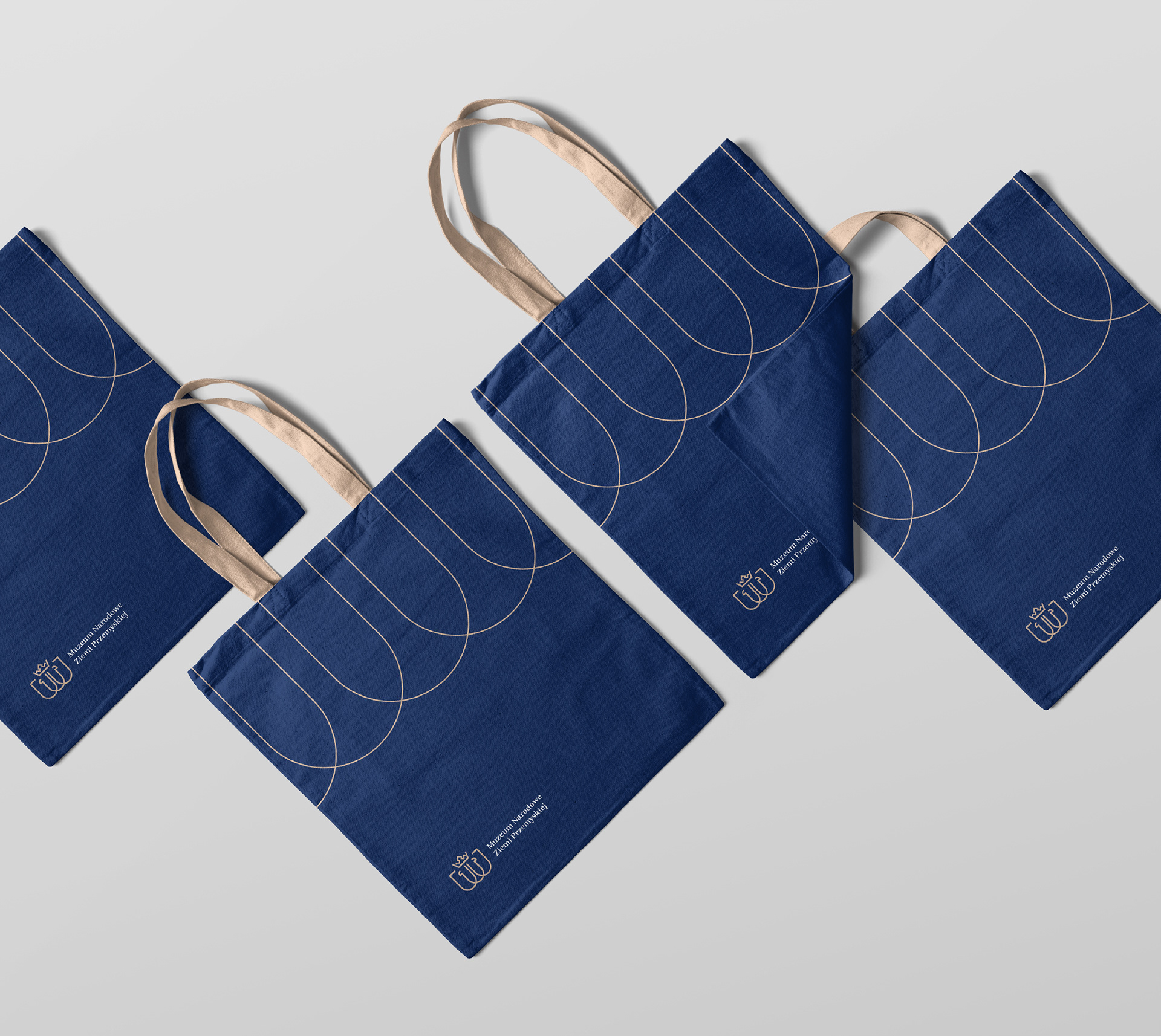
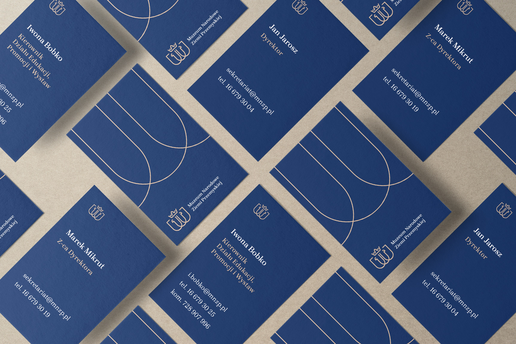
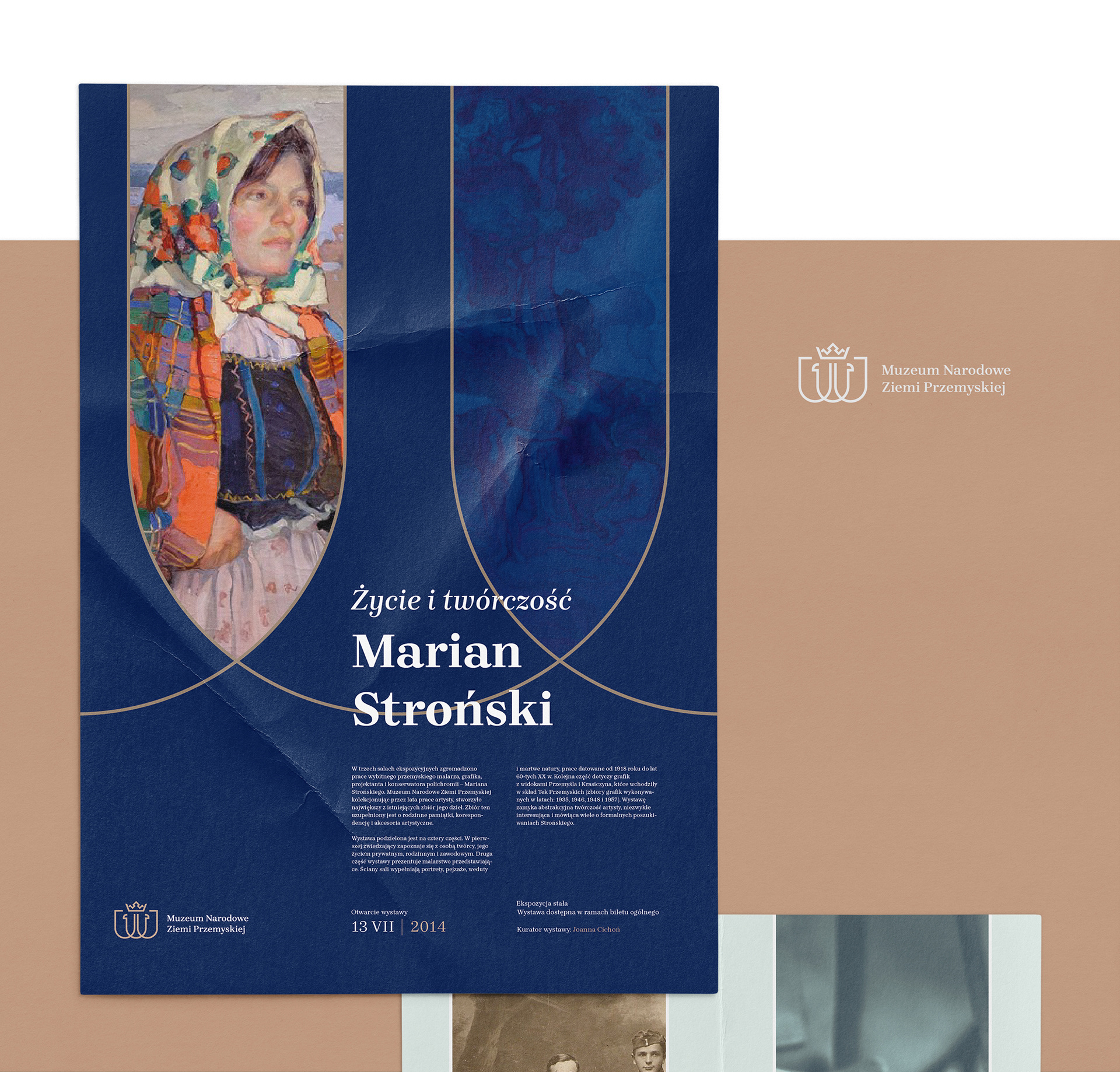
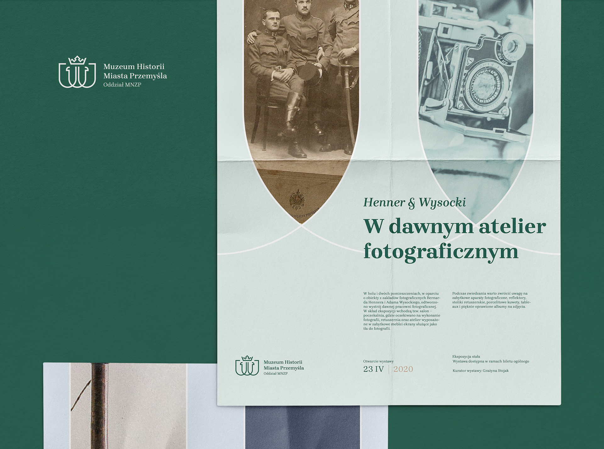
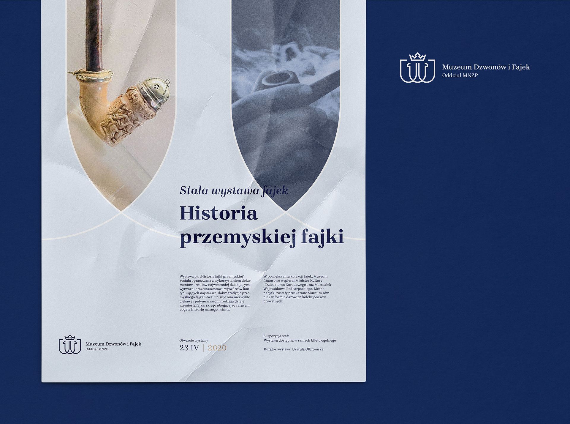
The resulting logo defined the concept of the leading graphic theme, which is based on the multiplication of shields. The selected colors result from coherent elements - the colors of the coat of arms of the Przemyśl Land and the City of Przemyśl. The combination of navy-blue color and golden details skillfully harmonizes with the museum's historical and contemporary activities.
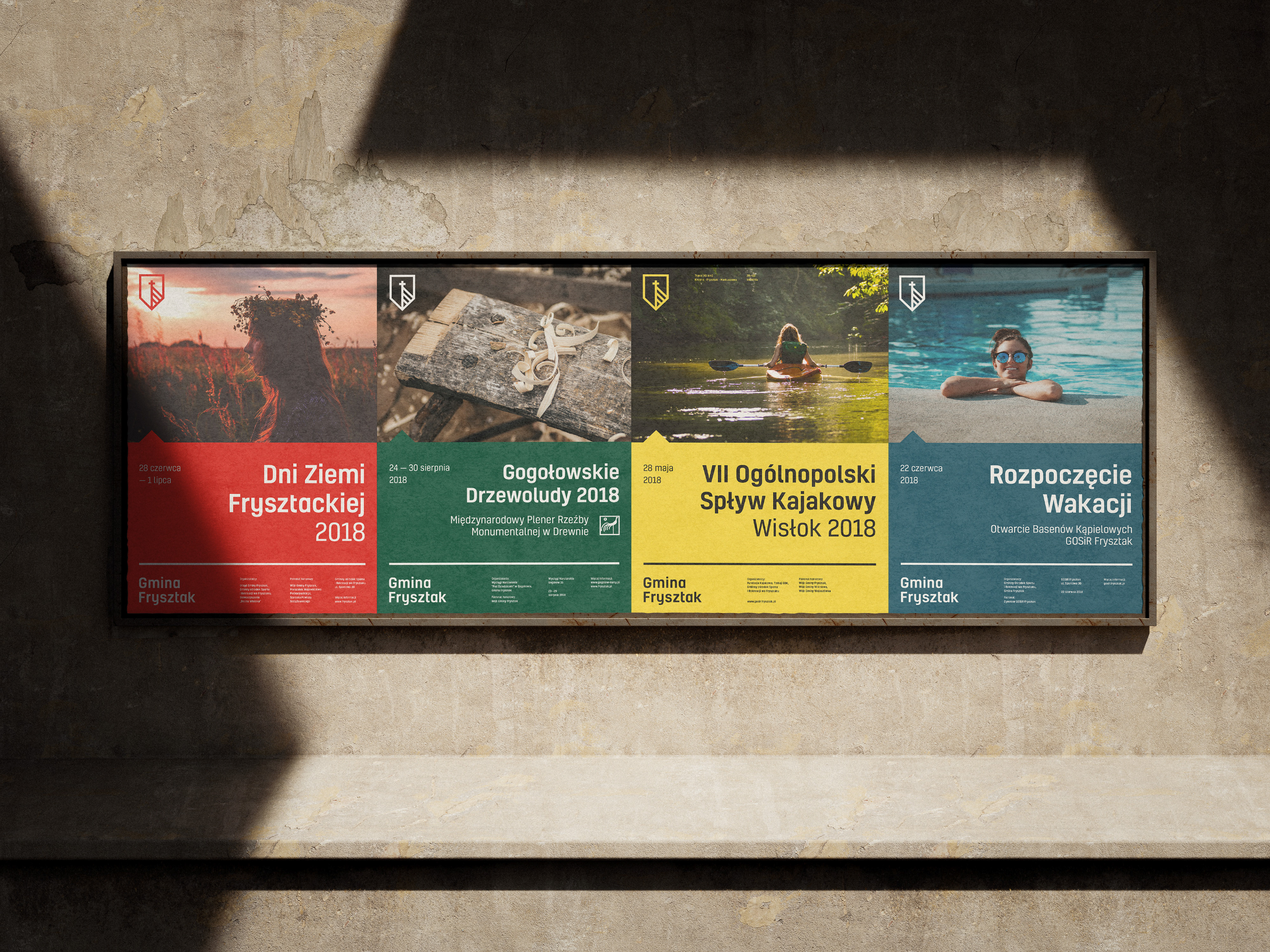
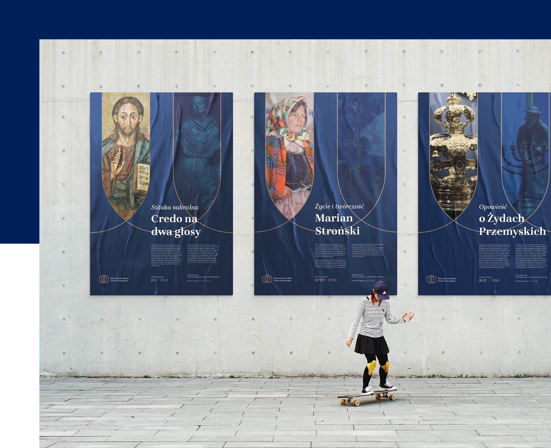
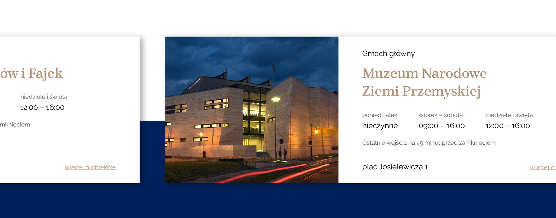
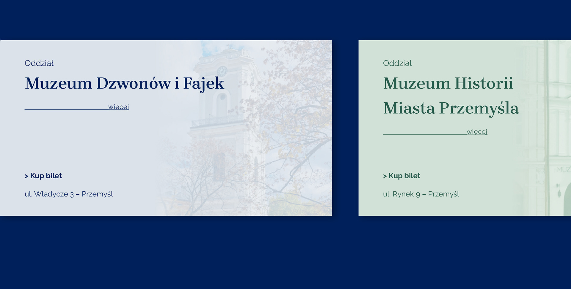
The project also covered branches of the MNZP. The way of shaping their image so far gave the impression of separate institutions. The final visual identification system ensures consistency and sufficient individuality for each branch. In addition, it also has its informational function – the selected colors refer to the facades of the buildings, which makes the tourists easier to navigate when visiting Przemyśl.

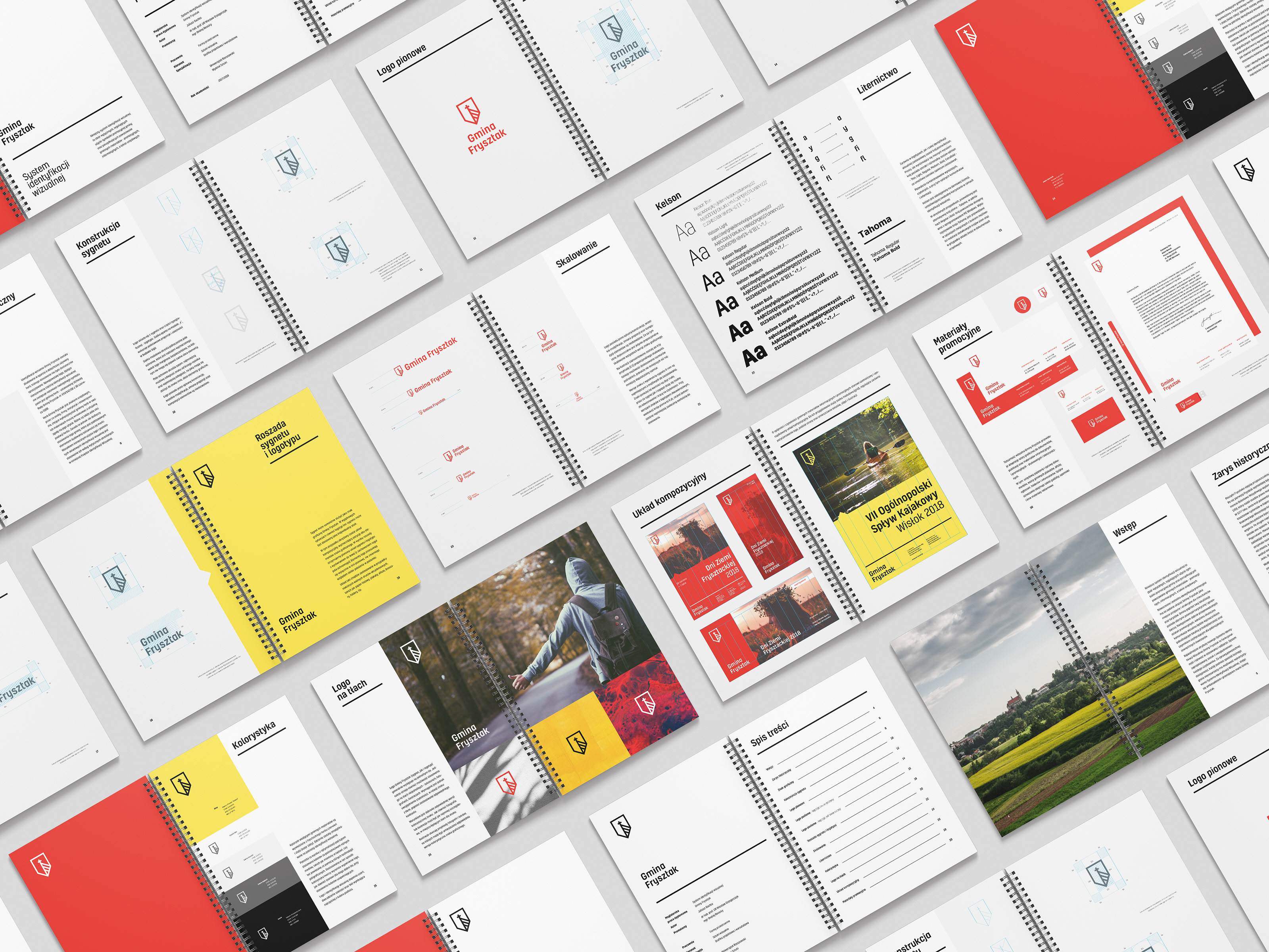
The project standardizes the created visual identification handbook, which allows to clearly understand the structure of the logo and the way of creating subsequent elements of visual identity.
The second part of our work on the new image of the museum was the space for new media
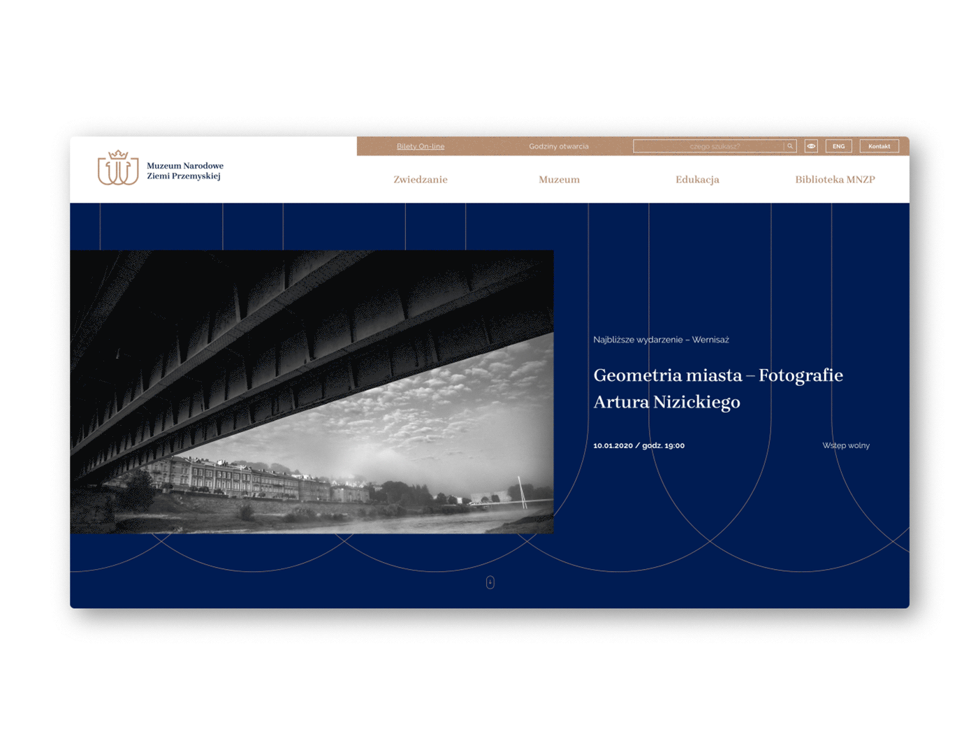
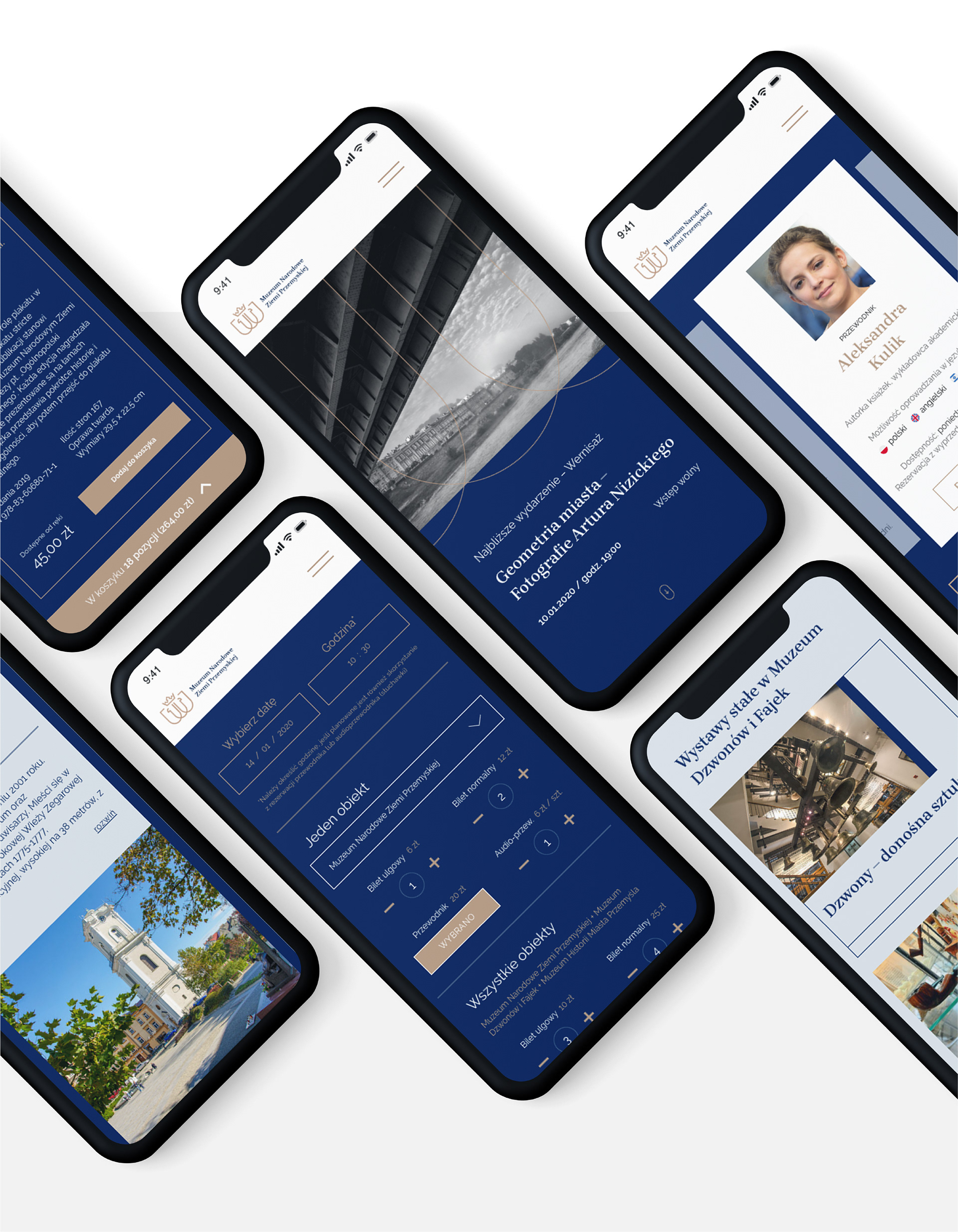
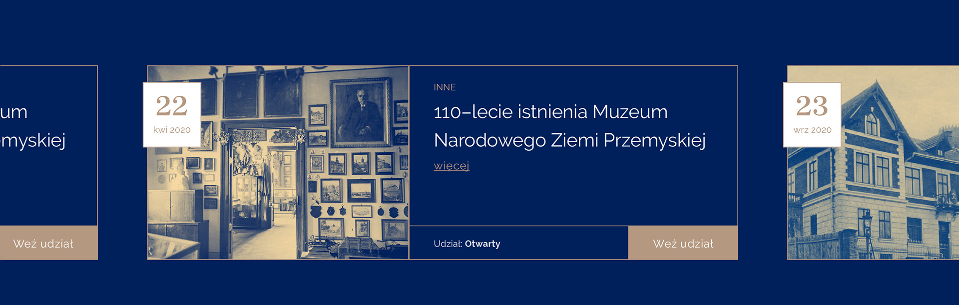
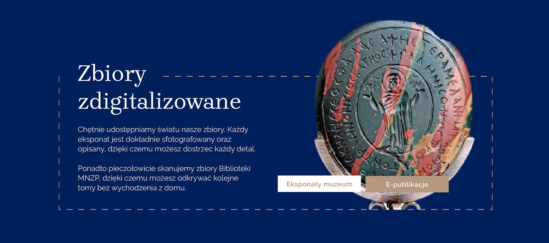
We have developed a new information and navigation architecture, and a way to present various types of publications on the website. However, main effort has been made to design an interface that will provide appropriate utility values, but also retain a certain visual clarity that a cultural institution should stand out.
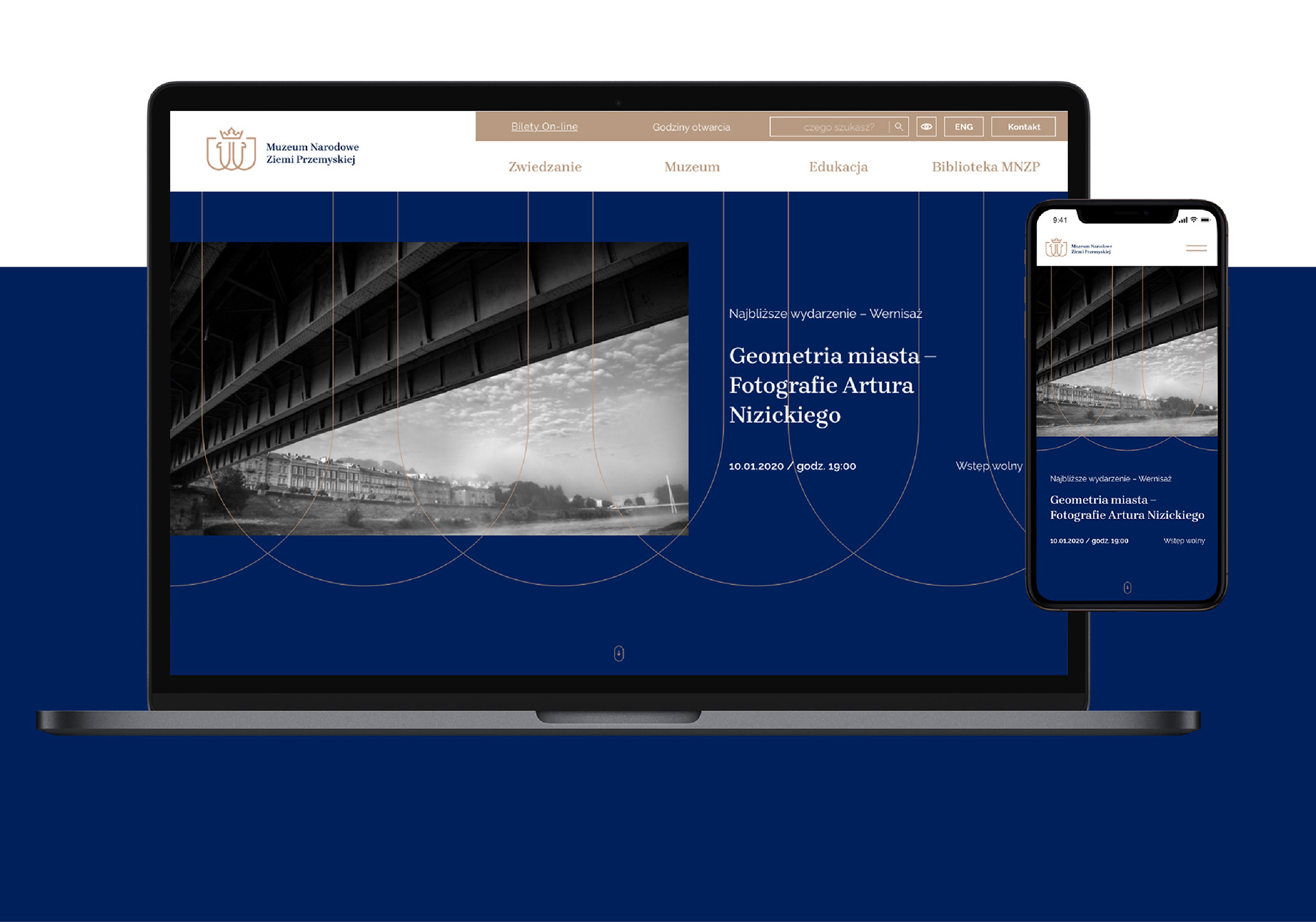
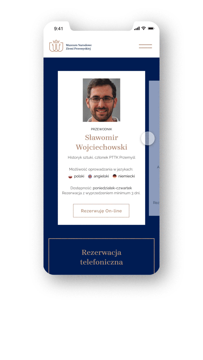
The new project includes the concept of new functionalities – among others online ticket and guides booking.

Range of activities:
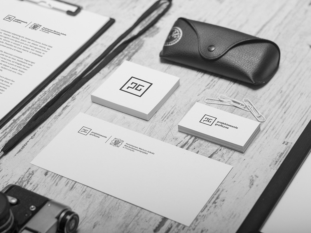
Logo, key visual, brand identity, stationery, event posters, promotional materials, brand book, UX/UI – web design
Client:
Logo, key visual, brand identity, stationery, event posters, promotional materials, brand book, UX/UI – web design
Client:
The National Museum of the Przemyśl Land (MNZP)
Project coordination:
Iwona Bobko (MNZP) / Marcin Tkaczyk
Logo Design:
Juliusz Bachta, Marcin Tkaczyk
Consultant:
Wiesław Grzegorczyk
Brand Design:
Juliusz Bachta, Marcin Tkaczyk
Webdesign (UX/UI):
Marcin Tkaczyk
Stationery, Brand Book:
Juliusz Bachta
Animation:
Oleksandr Mitin
___
s-sense.pl
s-sense.pl